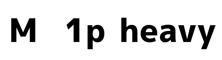
M+ 1p heavy
Do you have the right license?
Having the right license means that you protect yourself from negative legal consequences of not getting proper permissions. Make sure you have the right license by purchasing the individual font or to use a tool like Envato where all fonts are commercially licensed automatically.
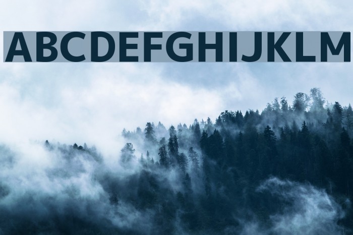
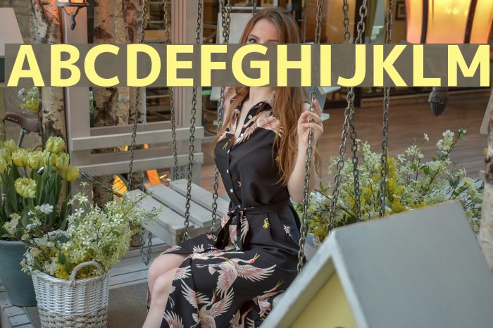
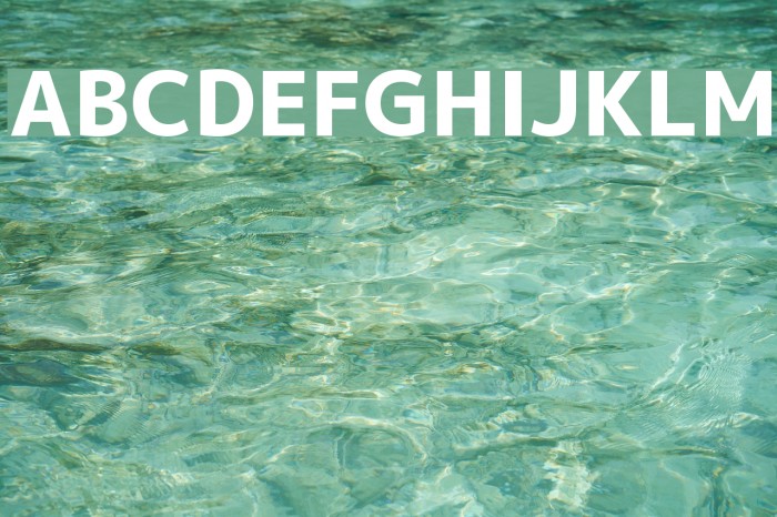
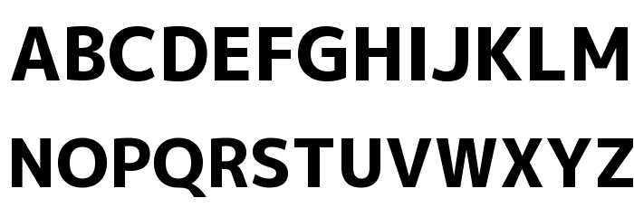
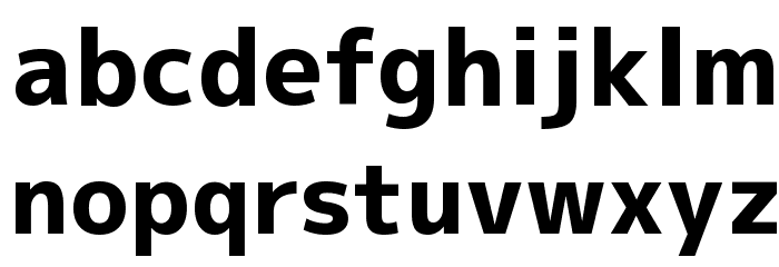
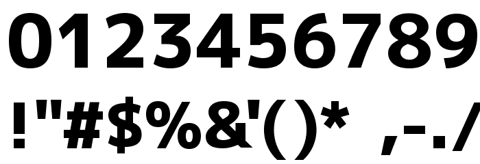
This font features bold, strong lines with a modern and clean aesthetic. The characters are well-defined with a consistent stroke width, giving it a robust and impactful appearance. The uppercase and lowercase letters maintain a uniform style, ensuring readability and clarity. The numerals are straightforward and align well with the overall design. Special characters are included, matching the boldness of the alphabetic characters. This font is versatile, suitable for various design needs where a strong presence is required.
A bold, modern font with strong lines and a clean aesthetic.
- : 1,842
- mplus-1p-heavy.ttf
- : M+ 1p heavy
- : Bold
- : Version Version 1.036
- : 5446
- Proposed Projects: Ideal for branding, headlines, posters, and any design requiring a bold statement.
- Category: Sans-Serif
- Bold: Yes
- Italic: No
- Weight: Bold
- Width: Normal
- Character Spacing: Normal
- Contrast: Low
- Overall Style: Modern
- Use Case: Headlines, Logos, Posters
- :
- :
Glyphs ! # $ % ( ) * + , - . / 0 1 2 3 4 5 6 7 8 9 : ; = ? @ A B C D E F G H I J K L M N O P Q R S T U V W X Y Z [ ] ^ _
Gallery Examples