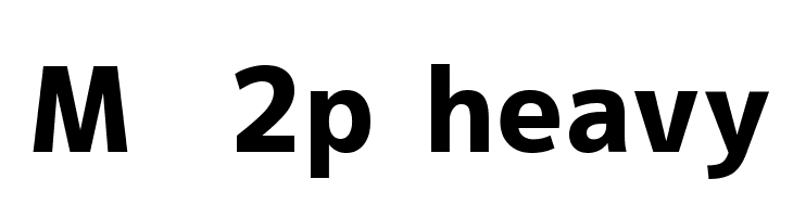
M+ 2p heavy
Do you have the right license?
Having the right license means that you protect yourself from negative legal consequences of not getting proper permissions. Make sure you have the right license by purchasing the individual font or to use a tool like Envato where all fonts are commercially licensed automatically.
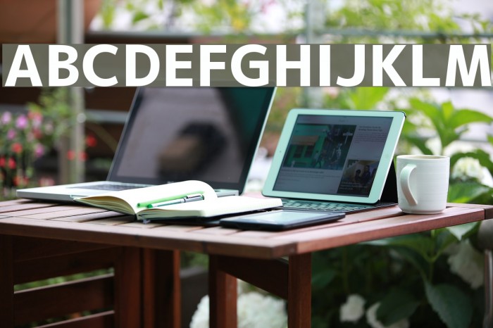
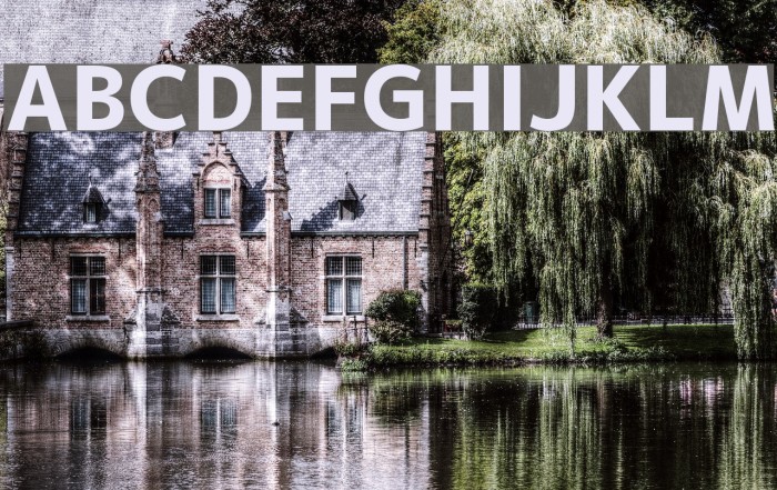
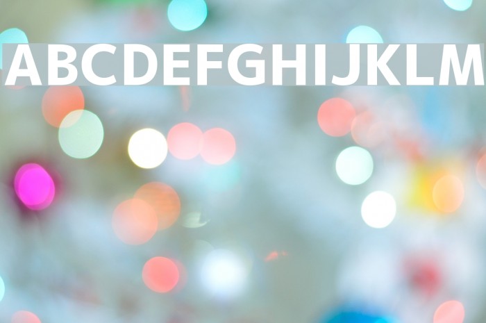
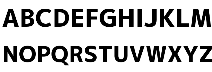
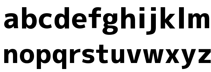
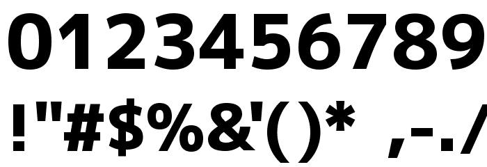
This font features a bold and robust design with clean, straight lines and a modern aesthetic. The uppercase and lowercase letters are well-proportioned, with a consistent stroke width that conveys strength and clarity. The numerals are clear and easy to read, making them suitable for a variety of applications. Special characters are included, maintaining the same bold style, ensuring versatility in design projects. The overall appearance is professional and contemporary, making it ideal for impactful headlines and branding.
A bold, modern font with clean lines and strong presence.
- : 2,568
- mplus-2p-heavy.ttf
- : M+ 2p heavy
- : Bold
- : Version Version 1.036
- : 5446
- Proposed Projects: Ideal for branding, advertising, headlines, and signage where a strong, modern impression is needed.
- Category: Sans-Serif
- Bold: Yes
- Italic: No
- Weight: Bold
- Width: Normal
- Character Spacing: Normal
- Contrast: Low
- Overall Style: Modern
- Use Case: Headlines, Logos, Branding
- :
- :
Glyphs ! # $ % ( ) * + , - . / 0 1 2 3 4 5 6 7 8 9 : ; = ? @ A B C D E F G H I J K L M N O P Q R S T U V W X Y Z [ ] ^ _
Gallery Examples