poor weekdays Italic
Do you have the right license?
Having the right license means that you protect yourself from negative legal consequences of not getting proper permissions. Make sure you have the right license by purchasing the individual font or to use a tool like Envato where all fonts are commercially licensed automatically.
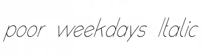
poor weekdays Italic
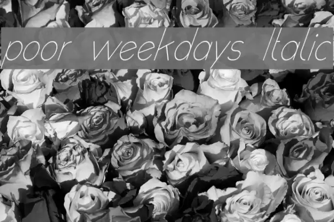
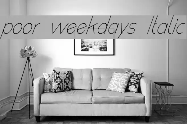
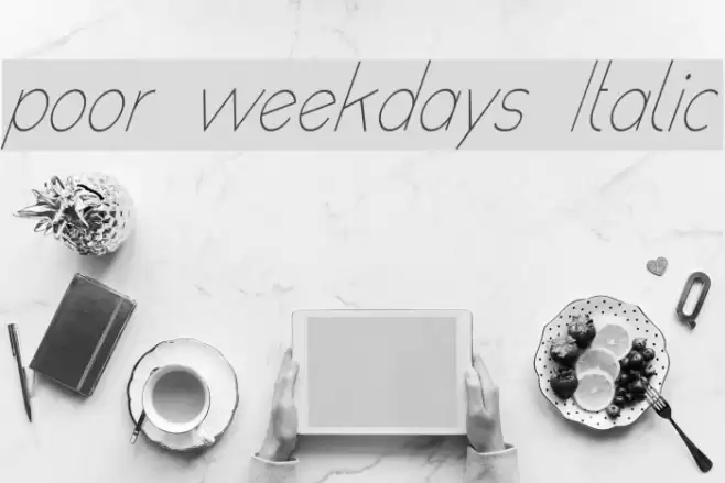
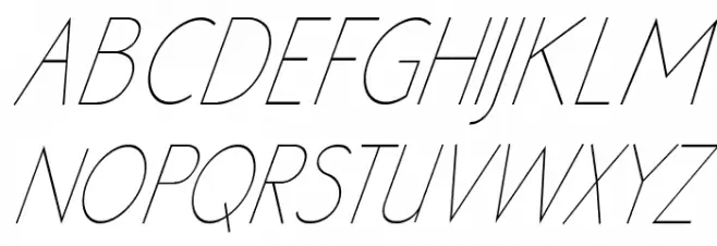
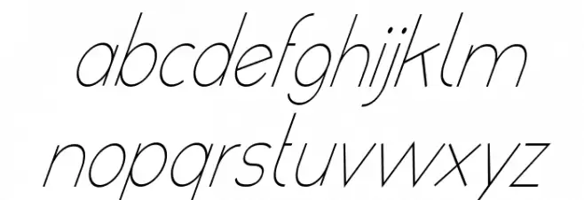
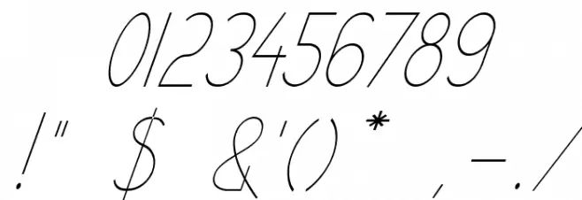
This font features a sleek, elegant design with a distinct italic slant, giving it a sense of movement and sophistication. The characters are thin and elongated, with a consistent stroke width that adds to its refined appearance. The uppercase letters are tall and narrow, while the lowercase letters maintain a smooth, flowing style. The numerals are clear and legible, matching the overall aesthetic. Special characters are well-integrated, maintaining the font's cohesive look. This typeface exudes a modern and stylish vibe, making it suitable for various creative applications.
A sleek, italic font with thin, elongated characters and a modern style.
- : 124
- ( Fonts by Roland Huse - rolandhuse.com FREE )
- poor weekdays italic.ttf
- : poor weekdays Italic
- : Italic
- : Version Version 1.000
- : 183
- Proposed Projects: Ideal for fashion magazines, elegant invitations, branding for luxury products, and modern website headers.
- Category: Sans-Serif
- Bold: No
- Italic: Yes
- Weight: Light
- Width: Condensed
- Character Spacing: Normal
- Contrast: Low
- Overall Style: Modern
- Use Case: Headlines, Logos, Invitations
- :
- :
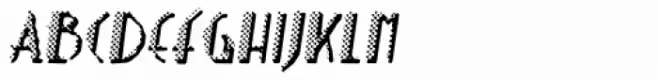
Glyphs ! $ ( ) * + , - . / 0 1 2 3 4 5 6 7 8 9 : ; = ? @ A B C D E F G H I J K L M N O P Q R S T U V W X Y Z [ ] _ ` a b c d e f g h i j k l m n o p q r s t u v w x y z { | }
poor weekdays Italic
poor weekdays Italic
poor weekdays Italic
Gallery Examples