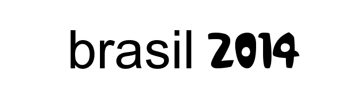
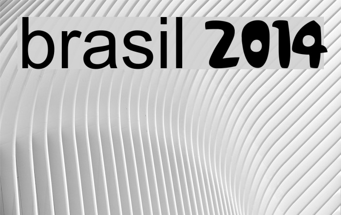
brasil 2014
Do you have the right license?
Having the right license means that you protect yourself from negative legal consequences of not getting proper permissions. Make sure you have the right license by purchasing the individual font or to use a tool like Envato where all fonts are commercially licensed automatically.
This font features a playful and bold design, characterized by its rounded edges and thick strokes. The uppercase letters are uniform in height, while the lowercase letters maintain a consistent baseline, creating a cohesive look. The numbers are distinct with a slightly exaggerated curvature, adding to the font's whimsical nature. The overall style is modern and approachable, making it suitable for a variety of creative applications. The font's unique personality is further enhanced by its wide character spacing, which ensures readability and impact.
A playful, bold font with rounded edges and wide spacing.
- : 5,896
- brasil 2014 numeros.ttf
- : brasil 2014
- : Regular
- : Version Version 1.00 October 1, 2012, initial release
- : 236
- Proposed Projects: Ideal for children's books, playful branding, event posters, and merchandise design.
- Category: Decorative/Display
- Bold: Yes
- Italic: No
- Weight: Bold
- Width: Normal
- Character Spacing: Wide
- Contrast: Low
- Overall Style: Modern
- Use Case: Headlines, Logos
- :
- :
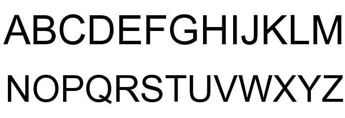
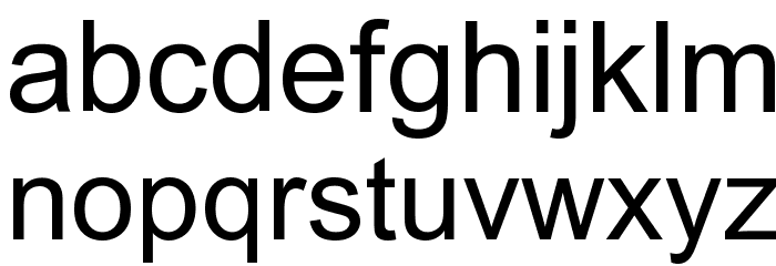
Glyphs ! # $ % ( ) * + , - . / 0 1 2 3 4 5 6 7 8 9 : ; = ? @ A B C D E F G H I J K L M N O P Q R S T U V W X Y Z [ ] ^ _ ` a b c d e f g h i j k l m n o p q r s t u v w x y z { | } ~

Gallery Examples

-
 Web Hebrew AD Web Hebrew AD
 -
Yudit V1 Yudit V1

-
Applied Sans Applied Sans
Similar free fonts for Applied Sans font -
AG Schoolbook Two BQ Regular AG Schoolbook Two BQ Regular
Similar free fonts for AG Schoolbook Two BQ Regular font


-
 Buy font Aerovias Brasil NF
 -
 Buy font DIN 2014 Bold
 -
 Buy font DIN 2014 ExtraLight
 -
 Buy font DIN 2014 Narrow Extra Light
 -
 Buy font DIN 2014 Narrow Demi
 -
 Buy font DIN 2014 ExtraLight Italic
 -
 Buy font DIN 2014 Demi Italic
 -
 Buy font DIN 2014 Light
 -
 Buy font DIN 2014 Narrow
 -
 Buy font DIN 2014 Light Italic
 -
 Buy font DIN 2014 Narrow Bold
 -
 Buy font DIN 2014 Italic
 -
 Buy font DIN 2014 Narrow ExtraBold
 -
 Buy font DIN 2014 Bold Italic
 -
 Buy font DIN 2014 Demi
 -
 Buy font DIN 2014 ExtraBold
 -
 Buy font DIN 2014 ExtraBold Italic
 -
 Buy font DIN 2014 Narrow Light