Tempo Esperanto Dika
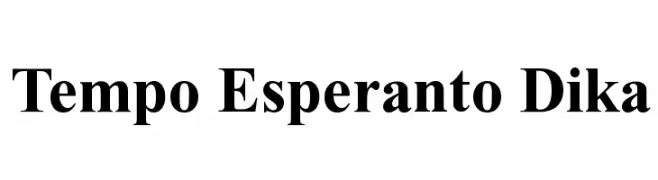
Tempo Esperanto Dika
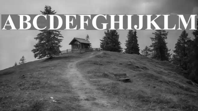
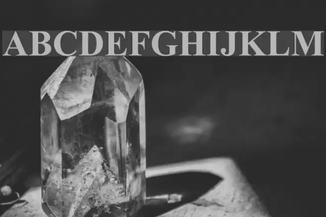
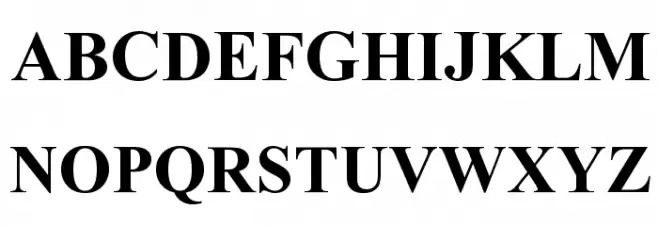
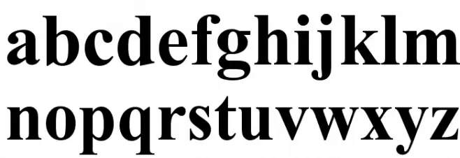
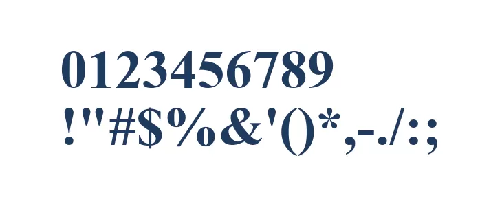
This font features a bold and classic serif design, characterized by its strong, thick strokes and high contrast between thick and thin lines. The serifs are pronounced and slightly curved, giving it a traditional yet elegant appearance. The uppercase letters are tall and commanding, while the lowercase letters maintain a consistent style with a slightly more rounded form. The numerals are robust and clear, ensuring legibility. Special characters are well-defined, maintaining the overall aesthetic of the font. This typeface exudes a sense of authority and sophistication, making it suitable for formal and impactful designs.
A bold, high-contrast serif font with a classic and authoritative style from Serif fonts.
- : 4,242
- TEMPOD.TTF
- : Tempo Esperanto Dika
- : Dika
- : Version :V1.00
- : 222
- Proposed Projects: Ideal for book covers, editorial headlines, formal invitations, and branding materials that require a touch of elegance and authority.
- Category:
- Bold: Yes
- Italic: No
- Weight: Bold
- Width: Normal
- Character Spacing: Normal
- Contrast: High
- Overall Style: Classic
- Use Case: Headlines, Logos, Editorials
- :
- :
Glyphs ! # $ % ( ) * + , - . / 0 1 2 3 4 5 6 7 8 9 : ; = ? @ A B C D E F G H I J K L M N O P Q R S T U V W X Y Z [ ] ^ _
Tempo Esperanto Dika
Tempo Esperanto Dika
Tempo Esperanto Dika
Gallery Examples