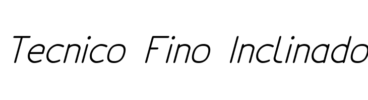
Tecnico Fino Inclinado
Do you have the right license?
Having the right license means that you protect yourself from negative legal consequences of not getting proper permissions. Make sure you have the right license by purchasing the individual font or to use a tool like Envato where all fonts are commercially licensed automatically.
Tecnico Fino Inclinado
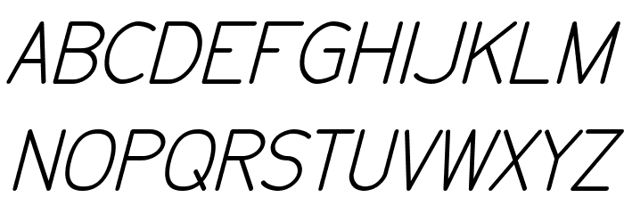
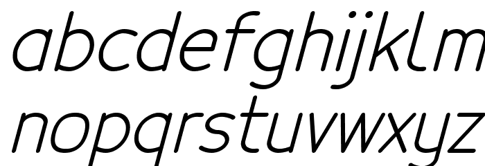
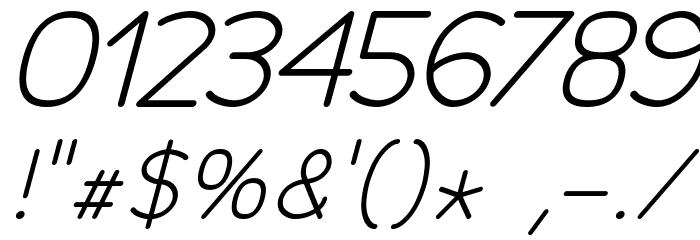
This font features a sleek, modern design with a slight incline, giving it a dynamic and forward-moving appearance. The characters are crafted with a thin, uniform stroke that maintains a consistent width throughout, contributing to a clean and minimalist aesthetic. The uppercase and lowercase letters are well-proportioned, with a slight slant that adds a sense of motion and elegance. The numerals are clear and legible, matching the overall style of the alphabet. Special characters are included, maintaining the same thin and inclined style, ensuring consistency across all glyphs. This font is ideal for projects that require a contemporary and professional look.
A sleek, inclined, and modern font with thin strokes and a dynamic appearance.
- : 201
- tecnico_regularitalic.ttf
- : Tecnico Fino Inclinado
gomez447 - : FinoInclinado
- : Version Version 1.3
- : 250
- Proposed Projects: Ideal for branding, advertising, modern web design, and editorial layouts.
- Category: Sans-Serif
- Bold: No
- Italic: Yes
- Weight: Light
- Width: Normal
- Character Spacing: Normal
- Contrast: Low
- Overall Style: Modern
- Use Case: Headlines, Body text, Logos
- :
- :
Glyphs ! # $ % ( ) * + , - . / 0 1 2 3 4 5 6 7 8 9 : ; = ? @ A B C D E F G H I J K L M N O P Q R S T U V W X Y Z [ ] ^ _ ` a b c d e f g h i j k l m n o p q r s t u v w x y z { | } ~
Tecnico Fino Inclinado
Tecnico Fino Inclinado
Tecnico Fino Inclinado
Gallery Examples