Merit Italic
Merit Italic
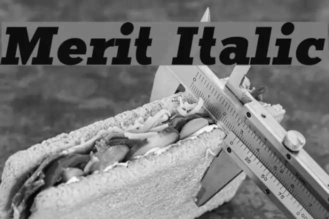
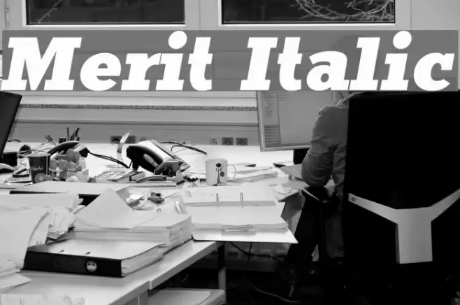
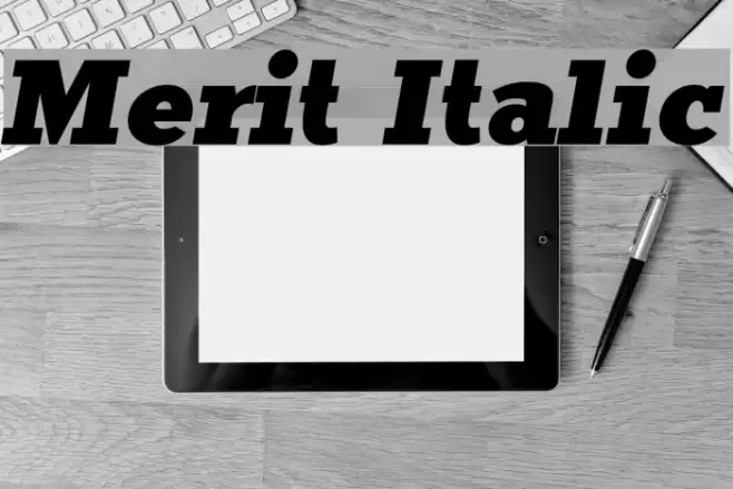
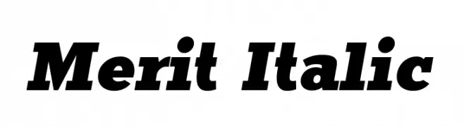
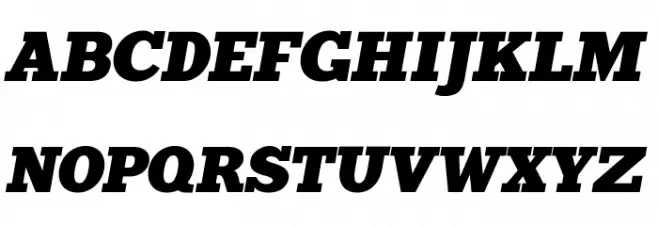
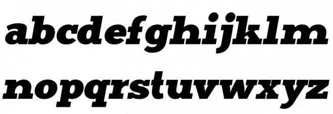
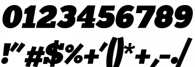
This font exhibits a bold and dynamic presence with its italicized style, offering a sense of movement and emphasis. The characters are robust and well-defined, with a strong contrast between thick and thin strokes, enhancing readability and visual impact. The uppercase letters are commanding, while the lowercase letters maintain a consistent flow, making it versatile for various design needs. The numerals are clear and distinct, ensuring legibility in numerical data presentation. Special characters are included, providing comprehensive usage across different contexts.
A bold, italicized font with strong contrast and dynamic style from Thick fonts.
- : 1,781
- ( Scott Simpson FREE )
- merititalic4.ttf
- : Merit Italic
- : Italic
- : Version Version 1.000
- : 101
- Proposed Projects: Ideal for branding, advertising, headlines, and editorial design where emphasis and impact are desired.
- Category:
- Bold: Yes
- Italic: Yes
- Weight: Bold
- Width: Normal
- Character Spacing: Normal
- Contrast: High
- Overall Style: Modern
- Use Case: Headlines, Logos, Branding
- :
- :
Glyphs ! # $ % ( ) * + , - . / 0 1 2 3 4 5 6 7 8 9 : ; = ? @ A B C D E F G H I J K L M N O P Q R S T U V W X Y Z [ ] ^ _ a b c d e f g h i j k l m n o p q r s t u v w x y z { | }
Merit Italic
Merit Italic
Merit Italic
Gallery Examples