M+ 1p bold

Do you have the right license?
Having the right license means that you protect yourself from negative legal consequences of not getting proper permissions. Make sure you have the right license by purchasing the individual font or to use a tool like Envato where all fonts are commercially licensed automatically.
M+ 1p bold
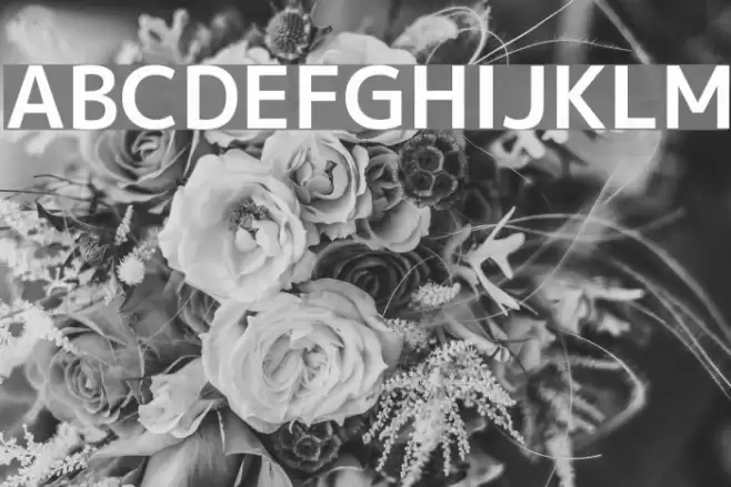
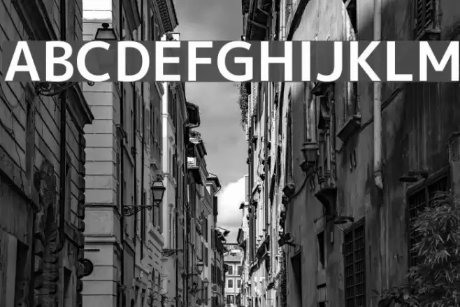
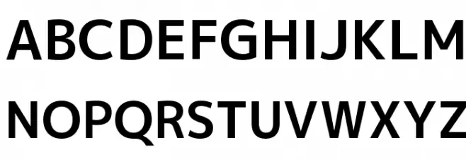
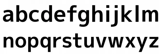
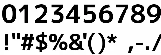
This font features a clean and modern sans-serif style with bold, uniform strokes that provide a strong visual impact. The characters are well-proportioned, offering a balanced and harmonious appearance. The uppercase letters are slightly taller than the lowercase, maintaining a consistent width throughout. The numerals are clear and easily distinguishable, making them suitable for various applications. Special characters are designed with the same boldness, ensuring they stand out without overpowering the text. Overall, this font conveys a sense of professionalism and clarity, making it ideal for both digital and print media.
A bold, modern sans-serif font with clean lines and uniform strokes.
- : 1,290
- mplus-1p-bold.ttf
- : M+ 1p bold
- : Bold
- : Version Version 1.036
- : 5446
- Proposed Projects: Ideal for branding, advertising, headlines, and digital media where clarity and impact are essential.
- Category: Sans-Serif
- Bold: Yes
- Italic: No
- Weight: Bold
- Width: Normal
- Character Spacing: Normal
- Contrast: Low
- Overall Style: Modern
- Use Case: Headlines, Logos, Branding
- :
- :
Glyphs ! # $ % ( ) * + , - . / 0 1 2 3 4 5 6 7 8 9 : ; = ? @ A B C D E F G H I J K L M N O P Q R S T U V W X Y Z [ ] ^ _
M+ 1p bold
M+ 1p bold
M+ 1p bold
Gallery Examples