Komika Display Kaps Wide

Do you have the right license?
Having the right license means that you protect yourself from negative legal consequences of not getting proper permissions. Make sure you have the right license by purchasing the individual font or to use a tool like Envato where all fonts are commercially licensed automatically.
Komika Display Kaps Wide
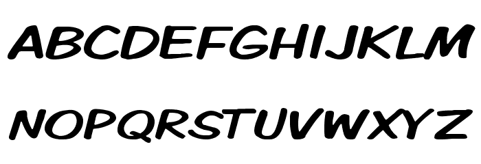
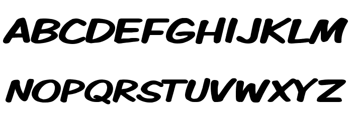
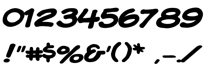
This font features a playful and bold style with a handwritten appearance, characterized by its wide and rounded letterforms. The strokes are thick and consistent, giving it a strong presence. The uppercase letters are slightly slanted, adding a dynamic feel, while the lowercase letters maintain a similar style, ensuring uniformity. The numbers and special characters follow the same design principles, making the font versatile for various uses. Its informal and friendly look makes it suitable for projects that require a casual and approachable tone.
A bold, playful font with a handwritten style and wide, rounded letters.
- : 484
- ( Fonts by Apostrophic Lab FREE )
- KMKDSPKW.ttf
- : Komika Display Kaps Wide
- : Regular
- : Version 2.0
- : 225
- Proposed Projects: Ideal for comic books, children's books, playful branding, and informal posters.
- Category: Handwritten
- Bold: Yes
- Italic: No
- Weight: Bold
- Width: Expanded
- Character Spacing: Normal
- Contrast: Low
- Overall Style: Playful
- Use Case: Headlines, Logos, Posters
- :
- :
Glyphs ! # $ % ( ) * + , - . / 0 1 2 3 4 5 6 7 8 9 : ; = ? @ A B C D E F G H I J K L M N O P Q R S T U V W X Y Z [ ] ^ _ ` a b c d e f g h i j k l m n o p q r s t u v w x y z { | } ~
Komika Display Kaps Wide
Komika Display Kaps Wide
Komika Display Kaps Wide
Gallery Examples