FaberSansPro-LeichtKursiv
Do you have the right license?
Having the right license means that you protect yourself from negative legal consequences of not getting proper permissions. Make sure you have the right license by purchasing the individual font or to use a tool like Envato where all fonts are commercially licensed automatically.
FaberSansPro-LeichtKursiv
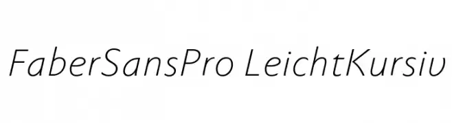
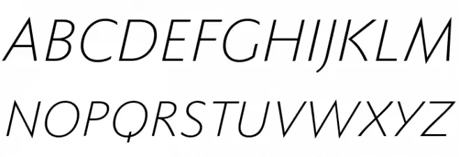
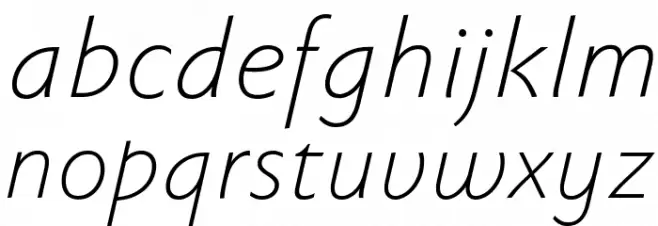
This font features a sleek and modern sans-serif design with a light and airy feel. The characters are slightly italicized, giving a sense of elegance and fluidity. The strokes are consistent and smooth, with a medium contrast that enhances readability while maintaining a stylish appearance. The overall look is clean and sophisticated, making it suitable for a variety of design applications. The spacing between characters is normal, ensuring clarity and legibility across different sizes.
A modern, light, and italicized sans-serif font with medium contrast.
- : 263
- ( Fonts by Ingo Zimmermann - www.ingofonts.com FREE )
- FaberSansPro46reduced.ttf
- : FaberSansPro-LeichtKursiv
- : 46 Leicht Kursiv
- : Version Version 4.013
- : 56
- Proposed Projects: Ideal for branding, editorial design, and digital interfaces where a modern and elegant touch is desired.
- Category: Sans-Serif
- Bold: No
- Italic: Yes
- Weight: Light
- Width: Normal
- Character Spacing: Normal
- Contrast: Medium
- Overall Style: Modern
- Use Case: Headlines, Body text, Logos
- :
- :
Glyphs A B C D E F G H I J K L M N O P Q R S T U V W X Y Z a b c d e f g h i j k l m n o p q r s t u v w x y z
FaberSansPro-LeichtKursiv
FaberSansPro-LeichtKursiv
FaberSansPro-LeichtKursiv

Gallery Examples