Din Kursivschrift Eng
Do you have the right license?
Having the right license means that you protect yourself from negative legal consequences of not getting proper permissions. Make sure you have the right license by purchasing the individual font or to use a tool like Envato where all fonts are commercially licensed automatically.
Din Kursivschrift Eng
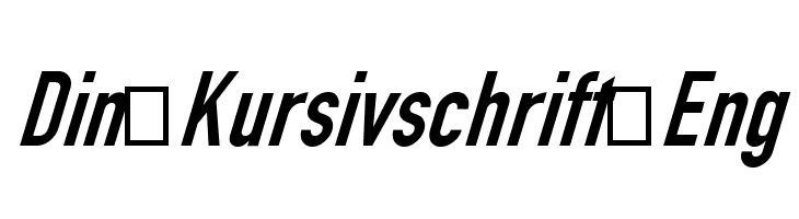
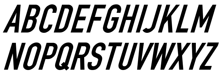
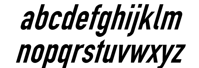
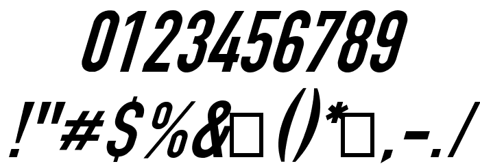
This font features a clean, modern design with a slight slant, giving it an italicized appearance. The characters are bold and have a uniform stroke width, contributing to a strong and assertive look. The uppercase letters are tall and narrow, while the lowercase letters maintain a consistent height, enhancing readability. Numbers are clear and distinct, matching the style of the alphabet. The special characters are well-defined, maintaining the font's cohesive style. Overall, this font exudes a professional and contemporary feel, suitable for various design applications.
A bold, italicized font with a modern, professional appearance.
- : 785
- DINKursivschriftEng.otf
- : Din Kursivschrift Eng
CannotIntoSpaceFonts - : Eng
- : Version 1.07
- : 189
- Proposed Projects: Ideal for branding, advertising, headlines, and signage where a modern and assertive look is desired.
- Category: Sans-Serif
- Bold: Yes
- Italic: Yes
- Weight: Bold
- Width: Condensed
- Character Spacing: Normal
- Contrast: Low
- Overall Style: Modern
- Use Case: Headlines, Logos, Signage
- :
- :
Glyphs ! # $ % ( ) * + , - . / 0 1 2 3 4 5 6 7 8 9 : ; = ? @ A B C D E F G H I J K L M N O P Q R S T U V W X Y Z [ ] ^ _ ` a b c d e f g h i j k l m n o p q r s t u v w x y z { | } ~
Din Kursivschrift Eng
Din Kursivschrift Eng
Din Kursivschrift Eng
Gallery Examples